

The single highest-leverage fix for most Shopify stores is this: switch your top collections to a default sort that prioritizes best-selling or featured products, compress and lazy-load every image below the fold, and write a genuinely unique collection description placed thoughtfully on the page to support SEO without harming user experience, not above it. That one combination touches conversion and crawlability at the same time, and it rarely takes a developer more than an afternoon per collection.
Before you touch anything else, run three checks today:
- Switch default sort on your five highest-traffic collections from “manual” or “alphabetical” to best-selling or featured, so browsers see winners first.
- Lazy-load and compress below-fold product images, since bloated thumbnails are still the most common speed killer on Shopify collection templates.
- Add or rewrite a unique collection description of appropriate length, placed below the grid so it supports Schema markup and search visibility without pushing products down the page.
While you’re in there, scan for the obvious damage: empty collections still linked in your navigation, sold-out products sitting in the first row, inconsistent image crops that make the grid look sloppy, and filters that vanish or break on mobile. Check Google Search Console for any collection URLs with zero impressions. That’s often the fastest way to find pages Google has quietly stopped bothering with. Most of these fixes live in your theme’s Shopify Liquid templates, and none of them require a full redesign.
Pro Tip: Screenshot your top three collections on mobile right now, before you change anything. You’ll want the “before” for comparison once you start editing, and most store owners forget until it’s too late.
Key Takeaways
Fixing collection page optimisation on Shopify works best in a fixed order: default sort and speed first, unique content second, technical crawl fixes third.
| Point | Details |
|---|---|
| Start with sort and speed | Switch default sort to best-selling and lazy-load below-fold images before touching anything else. |
| Place content below the grid | Write unique 150 to 300 word descriptions below the product grid to protect conversion while still ranking. |
| Fix faceted navigation early | Canonicalise filtered URLs to the clean collection page to stop crawl budget waste. |
| Measure in stages | Check click behaviour at 10 days, ranking at 30 to 60 days, and revenue at 90 days or beyond. |
| Bring in specialist help at scale | Moormarketing runs technical Shopify implementation, SEO copy and CRO testing as one engagement for stores past the DIY stage. |
Table of Contents
- What is collection page optimisation and why does it matter?
- What to write for collection descriptions and where to place it
- How should faceted navigation and pagination work?
- How do you design collection pages for conversion?
- How do you scale collection SEO across a large catalogue?
- How do you measure whether collection page changes are working?
- What’s the implementation checklist and timeline?
- Which filters should you actually keep? A usage-based audit
- How do reviews and personalisation fit into collection page optimisation?
- What else slows collection pages down beyond images?
- What actually goes wrong on Shopify collection pages, and when is it time to bring in help?
- Get expert help optimising your Shopify collection pages
- Sources
What is collection page optimisation and why does it matter?
Collection page optimisation is the practice of improving a Shopify category page’s on-page content, technical structure and layout so it ranks for commercial search terms and converts the traffic it attracts. It sits at the intersection of category page optimization and conversion rate optimisation, and treating it as purely an SEO task or purely a design task is where most stores go wrong.
Picking the right term level for your collection
Broad collections (“Women’s Shoes”) capture volume but face brutal competition. Long-tail collections (“Women’s Waterproof Hiking Boots”) convert at a higher rate because the searcher has already narrowed their own intent. The mistake most merchants make is picking one or the other. You need both: a handful of broad hub collections that anchor your site architecture, and a longer tail of specific collections that catch buyers closer to purchase. Match the term to what someone is actually typing, not what sounds good in a meeting.
H1, title tag and meta description
Shopify Liquid renders your collection’s title field as the H1 by default, and that same field often feeds the HTML title tag unless you’ve customised the SEO title separately in the admin. That’s a trap: your H1 needs to be readable for humans (“Men’s Running Shoes”), while your title tag has room for a bit more keyword and brand context (“Men’s Running Shoes | Free Shipping Over $100 | [Store Name]”). Keep the title tag under 60 characters where you can, and never let two collections share the same title. Duplicate titles across a footwear collection and its long-tail subcollection is one of the most common issues flagged in Shopify SEO audits, and it’s a straightforward fix once you know to look for it.
Meta descriptions don’t affect ranking directly, but they decide whether someone clicks. Write a short pitch, roughly 140 to 155 characters, that states what’s in the collection and gives a reason to click now, discount, range, or fast shipping.
Before: “Shoes” as the title, no meta description, generic “Shop our shoes” copy.
After: title tag “Women’s Running Shoes | Lightweight & Breathable”, meta description “Shop women’s running shoes built for daily miles. Free returns, sizes 5 to 11. Ships same day.” The H1 stays simple: “Women’s Running Shoes.”
URL handles and canonicalisation
Your URL handle should be readable and contain the keyword without nesting unnecessary parameters, so /collections/womens-running-shoes beats /collections/shoes-c123?cat=45. Every filtered or sorted version of that URL needs a canonical tag pointing back to the clean collection URL, otherwise you’re asking Google to index dozens of near-duplicate pages for one product set. You’ll edit the title, description and URL handle from the collection’s page in Shopify admin under Online Store, but canonical logic usually needs to be set in the theme’s Liquid templates, which is where a developer earns their keep.
What to write for collection descriptions and where to place it
Content structure matters as much as content quality. The pattern that performs best across most Shopify stores: a one or two sentence intro above the grid (just enough to confirm the searcher landed in the right place), then a longer supporting section of roughly 150 to 300 words below the grid, followed by a short FAQ block at the very bottom of the page.
This isn’t arbitrary. Shoppers scanning a category page want products first, and pushing 300 words above the fold buries what they came for. Search engines still crawl and index content below the grid just fine, so you get the SEO value without the conversion cost. Unique, well-placed collection descriptions paired with usable filters and smart default sorting are consistently linked to organic traffic and conversion gains on Shopify.
What goes in the below-grid copy:
- Answer the buyer’s core question first (what’s in this collection, who it’s for).
- Work in two secondary keywords naturally, without repeating the primary term awkwardly.
- Cover buyer considerations specific to the category: materials, fit guidance, compatibility, care instructions.
- Link internally to two or three related collections or your best guide content, such as a content marketing guide for ecommerce stores if you’re building out category level content strategy.
For the FAQ block, stick to genuine buyer questions: sizing, shipping timeframes, return policy specific to that category, and material or care questions. Mark these up with FAQ schema so they’re eligible for rich results. Add BreadcrumbList schema alongside your ItemList markup here too. Between the two, you’re giving Google a clean structural map of both the product list and the category hierarchy it sits in.
Before: blank description field, no FAQ, generic breadcrumb.
After: two-sentence intro above the grid, 220-word description below covering material and fit, three FAQ entries with schema, breadcrumb reading Home > Footwear > Running Shoes.
How should faceted navigation and pagination work?
Faceted navigation is where most Shopify stores quietly bleed crawl budget. Every combination of filter, size, colour, price band, generates a new URL, and left unmanaged, that can produce thousands of near-duplicate pages that Google has to crawl instead of your actual money pages.
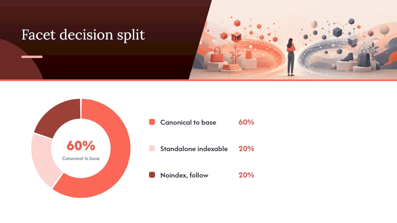
- Default to canonical, not noindex, for most filtered URLs. Point every filtered variation back to the clean collection URL unless a specific facet combination has genuine standalone search demand and enough products to justify its own page.
- Reserve noindex, follow for facet combinations with real traffic potential but thin results, such as a colour filter that returns only two products.
- Block genuinely low-value parameter combinations at the robots.txt or crawl-setting level once you’ve confirmed via Google Search Console that they’re being crawled at volume with no ranking value.
- Handle pagination with real, crawlable URLs (
?page=2,?page=3) rather than infinite scroll alone. If your theme uses infinite scroll for UX, make sure there are still discrete paginated URLs underneath it that a crawler can reach. - Canonicalise paginated pages to themselves, not back to page one, so Google can still discover and index products that only appear on page three or four.
At scale, this stops being a page-by-page decision and becomes a policy problem. Category-page SEO for larger catalogues depends on having a clear facet policy and pagination rule baked into the template itself, rather than deciding case by case as new filters get added.
A quick stat worth sitting with: faceted navigation, if left unmanaged, is one of the most commonly cited causes of wasted crawl budget on ecommerce sites, according to Semrush’s guide to ecommerce category page SEO. That’s crawl budget Google could be spending on your actual product and collection pages instead.
| Facet type | Typical decision | Reason |
|---|---|---|
| Size filter | Canonical to base URL | High combination count, low standalone search demand |
| Colour filter (high volume) | Consider standalone indexable page | Genuine search demand, enough products to fill the grid |
| Price range filter | Canonical to base URL | Rarely searched as a standalone term |
| Sort order (newest, price) | Canonical to base URL | Same products, different order, zero SEO value |
| Availability filter | Noindex, follow | Useful to shoppers, near-zero search demand |
On structured data: implement ItemList from schema.org on every collection page to define the set of products in that list, which supports product discovery in search results and can contribute to richer SERP presentation. Add BreadcrumbList alongside it for multi-level category paths. Neither is difficult to output from a Shopify theme once your developer has a template pattern to follow in Liquid, and neither needs to be rebuilt per collection, it’s a template-level job done once.
For sitemaps, don’t dump every filtered URL into your XML sitemap. Include your primary and long-tail collection URLs selectively, the ones you actually want indexed, and use the Coverage report in Google Search Console to spot faceted URLs that are being crawled but excluded, which is your signal that something in your facet policy needs tightening.
How do you design collection pages for conversion?
A collection page has to do two jobs that pull in different directions: satisfy a search engine’s need for content and structure, and satisfy a browser’s need to find the right product in under ten seconds. Get the balance wrong in either direction and you lose.
Start with the product card itself. Every card in the grid needs a consistent image crop (same aspect ratio, same product framing), a single-line price that doesn’t wrap awkwardly, visible review stars if you have them, and a title that’s still readable at thumbnail size. Inconsistent crops are one of the fastest ways to make a collection look cheap, even when the products themselves are good.

Default sort order deserves more attention than most stores give it. For evergreen collections, best-selling as the default sort tends to outperform alphabetical or “manual” sort because it puts your proven winners in front of new visitors immediately. Sort order and card fixes have been shown to lift click-through from collection to product page more reliably than a full page redesign, which is worth remembering next time someone suggests a ground-up redesign instead of a two-hour sort change.
Filters need a hierarchy too. Show the three filters that actually drive purchase decisions, usually size, colour or material, and price, prominently at the top, and tuck everything else into a “more filters” panel. Burying the filters someone actually needs behind a generic “Filter” button that requires two taps to open is a common mobile failure point.
- Keep the first product card fully visible within the initial mobile viewport, don’t let a banner or filter bar push it below the fold.
- Use a sticky filter and sort bar on mobile so shoppers don’t have to scroll back to the top to change their selection.
- Stick to a two-column grid on mobile rather than a single column, which halves the number of products a shopper sees per scroll.
- Lazy-load every image below the first row, compress thumbnails aggressively, and audit third-party scripts (reviews widgets, chat, personalisation tools) that might be slowing the page down.
- Preconnect to any CDN serving your images or fonts, which shaves meaningful time off first paint.
Pro Tip: Quick-add buttons work well for consumables and repeat-purchase items where the shopper already knows what they want. For considered purchases, furniture, apparel with sizing complexity, quick-add can actually hurt conversion by skipping the product page where trust-building content lives. Test it per collection rather than switching it on site-wide.
How do you scale collection SEO across a large catalogue?
Fixing five collections by hand is manageable. Fixing five hundred needs a template, not a checklist.
Build your collection template in Shopify Liquid so the copy slots (intro, description, FAQ), the schema output, and the facet behaviour are all controlled centrally. When you improve the pattern, every collection using that template inherits the improvement, instead of needing five hundred individual edits.
Decide your subcollection rules before your catalogue forces the decision for you. Create a child collection when you have both clear buyer intent and traffic evidence, a genuine subset of shoppers searching for “waterproof hiking boots” specifically, not just because a product happens to share a colour. If the intent isn’t there yet, a filter does the same job without adding another page to maintain and dilute link equity across.
- Set naming conventions for collection titles and URL handles so every new collection follows the same pattern (nobody hand-writes URLs when there’s a template to follow).
- Use bulk-editing apps or scripts to populate SEO title, meta description and metafields consistently, rather than leaving new collections blank until someone remembers.
- Assign canonical policy at the template level so a new collection inherits correct facet handling automatically.
- Schedule a quarterly audit of collection health: empty collections, thin descriptions, broken filters, and orphaned pages with no internal links pointing to them.
- For seasonal or empty collections, decide upfront whether to redirect, repopulate with new stock, or archive, rather than leaving a dead page live and indexed. Seasonal collections tied to a clear SEO strategy tend to outperform ones left to fade quietly after the season ends.
Community discussion among Shopify merchants keeps circling back to the same problem: tag pages and loosely planned keyphrases are a common source of duplicate or low-value pages once a catalogue grows past a few hundred SKUs. Solve it with governance now, not a cleanup project in two years.
How do you measure whether collection page changes are working?
Track five numbers: PDP click rate by traffic source, revenue per session, downstream conversion rate, filter use rate, and sort changes per session. Blend organic and paid traffic in your analysis and you’ll misread every result, because browsers arriving from a Meta ad behave nothing like someone who searched your exact product term on Google.
| Metric | Tool | Watch for |
|---|---|---|
| Impressions and query data | Google Search Console | New collections gaining impressions after 4 weeks |
| PDP click rate | GA4 or Shopify analytics | Lift after sort order or card design changes |
| Revenue per session | GA4 or Shopify analytics | Movement 30 to 90 days after content or layout changes |
| Filter use rate | GA4 custom events | Which filters shoppers actually touch |
| Faceted URL discovery | Site crawler (Screaming Frog or similar) | Unwanted URLs still being indexed |
Segmenting by traffic source before you change anything is the step most stores skip, and it’s the reason so many A/B tests on collection pages produce confusing, contradictory results. A layout that helps a Google searcher can actively hurt someone who arrived via a retargeting ad already knowing what they want.
- Days 1 to 10: watch click behaviour and immediate engagement metrics. This tells you whether a design change is landing, before ranking has had time to move.
- Days 30 to 60: check for organic ranking shifts in Search Console, particularly for collections where you changed the H1, title tag or meta description.
- Days 90 and beyond: assess revenue lift. Anything shorter than this and you’re likely reading noise, not signal.
Where possible, run client-side tests (sort order, card layout, filter placement) that don’t touch the indexable HTML at all, so you’re not risking ranking while you test conversion. If you do need to test H1, title tag or meta description changes, use a holdout group of comparable collections and monitor organic sessions specifically, not just conversion, since a title change can lift clicks in a SERP test while quietly hurting rank.
What’s the implementation checklist and timeline?
Prioritise by effort versus impact, not by what’s easiest to talk about in a meeting. Quick wins first, developer-dependent technical work in parallel, content last (because it takes longest to have an effect).
| Task | Typical effort | Dependency | Owner |
|---|---|---|---|
| Change default sort order | an afternoon per collection | None | Marketing |
| Compress and lazy-load images | 1 to 2 hours | Theme access | Developer or marketing |
| Write unique collection description | 2 to 4 hours per collection | None | Marketing |
| Fix canonical tags on filtered URLs | 1 to 3 days | Theme/Liquid changes | Developer |
| Implement ItemList and BreadcrumbList schema | 2 to 5 days | Theme access | Developer |
| Audit and fix faceted navigation policy | 3 to 5 days | GSC data, developer time | Developer with marketing input |
| Build reusable collection template | 1 to 2 weeks | All of the above decided first | Developer |
- Week one: fix sort order, image compression and lazy-loading across your top five collections by traffic.
- Week two: write and publish unique descriptions and FAQ blocks for those same five collections.
- Weeks three and four: developer implements canonical rules, ItemList and BreadcrumbList schema on the template.
- Month two: audit faceted navigation policy against Search Console crawl data, and adjust.
- Month three onward: roll the finished template out to the rest of the catalogue, and schedule the quarterly governance audit.
Handover checklist for a developer picking this up: canonical tags on every filtered and paginated URL, ItemList and BreadcrumbList schema output at the template level, lazy-loading on all below-fold imagery, and a staging environment test before anything goes live on your highest-traffic collections.
Which filters should you actually keep? A usage-based audit
Most Shopify collection pages carry filters nobody uses. They add visual clutter and cognitive load, and every filter option that returns two products or gets clicked by 1% of visitors is a filter that should be hidden, not featured.
- Instrument every filter click with a GA4 event (category: “filter_used”, label: filter type and value) or a Shopify-native tag event if your theme supports it.
- Measure usage as a percentage of sessions, segmented by device and by collection, since a filter that’s popular on desktop for one category can be dead weight on mobile for another.
- Apply the rule of thumb: filters used by a small minority of visitors, in practice, often single-digit percentages, are candidates to move into a “more filters” panel rather than sit in the primary row. This is a research-led guideline, not an absolute, so weigh it against your own data before cutting a filter entirely.
- Check what happens when a filter combination returns zero results. Either disable that combination in the UI before it’s selectable, or show closest matches with a clear message (“No exact matches, here’s what’s close”).
- Surface result counts next to each filter value (
Blue (14)) so shoppers know before they click whether a filter is worth using.
Pro Tip: Run this audit per collection, not site-wide. A size filter might be essential on your footwear collection and completely unused on your accessories collection. Treating filters as a global setting instead of a collection-specific one is how stores end up with cluttered pages that don’t serve either audience well.
How do reviews and personalisation fit into collection page optimisation?
Star ratings visible directly on the product card, not just on the product page, give shoppers a fast trust signal before they click through, and they can also feed into schema markup that supports richer search result presentation for individual products within your ItemList. If your review platform supports aggregate rating display at the collection level, use it. A grid where half the cards show four and five star ratings does more for conversion than another paragraph of description copy ever will.
Personalisation on collection pages doesn’t need to mean a complex recommendation engine. Simple wins go a long way: reordering products based on a shopper’s browsing history within the same session, surfacing “recently viewed” alongside the standard grid, or adjusting the default sort for returning visitors based on their previous purchase category. Shopify apps built for merchandising can handle basic personalisation without custom development, though anything more sophisticated, dynamic sort based on predicted purchase intent, for instance, usually needs a developer and a clear measurement plan so you can tell whether it’s actually lifting revenue per session or just adding complexity.
What else slows collection pages down beyond images?
Image compression gets all the attention, but server response time and script bloat often cost just as much. A collection page that calls five third-party apps, reviews widget, chat, upsell tool, personalisation script, back-to-back on page load will feel sluggish even with perfectly optimised images.
Audit your app list specifically for what loads on collection pages, not just checkout or product pages, since it’s easy to forget that a chat widget installed for support purposes is rendering on every single collection page across your store. Defer non-critical scripts until after the main content has painted, and remove any app you can’t justify keeping active on category pages specifically.
Server-side, look at how many Liquid loops your collection template runs per page load. A template that queries metafields, calculates reviews, checks inventory status, and pulls related products all in nested loops adds real render time, especially on collections with 50 or more products. Simplifying that logic, or paginating more aggressively so each page renders fewer products at once, often does more for speed than another round of image compression.
What actually goes wrong on Shopify collection pages, and when is it time to bring in help?
Most collection page problems aren’t strategy failures, they’re maintenance failures. A store launches with reasonable collection descriptions, decent sort order and clean canonicals, then eighteen months and four hundred new SKUs later, nobody’s kept up with metafields, half the collections are missing descriptions, and the facet policy that made sense at launch is generating thousands of crawlable URL combinations nobody planned for.
The honest answer on when to handle this in-house versus bringing in outside help comes down to three things: how much technical debt has built up, how large your catalogue has grown, and how much developer time you actually have free. If you’re running under fifty collections and have a developer who’s comfortable in Shopify Liquid and theme architecture, most of what’s covered here is achievable in-house over a few focused weeks. Past a few hundred collections, or if your current theme has been patched by three different freelancers over as many years, the technical cleanup alone (canonical policy, facet handling, template rebuilds) usually needs someone who’s done this exact type of Shopify migration before, because the edge cases (variant-only collections, out-of-stock handling, multi-currency stores) multiply fast and aren’t obvious until they break something.
Moormarketing’s work with growing ecommerce brands consistently comes back to the same pattern: the highest-leverage fixes are rarely the flashy ones. A cleaned-up sort order and a properly canonicalised facet structure tend to move revenue faster than a full redesign, because they fix what’s actively costing you clicks and crawl budget right now, rather than what looks better in a pitch deck.
Get expert help optimising your Shopify collection pages
Moormarketing is the alternative to guessing your way through a Shopify theme rebuild: our senior strategists implement the technical fixes (Liquid template changes, canonical policy, schema output) alongside the copy and conversion work in one engagement, instead of you piecing it together from three different freelancers and an app marketplace.

We run this as a focused audit of your five highest-traffic collection pages, covering technical Shopify implementation, SEO copy that sits below the grid where it belongs, CRO testing on sort order and card design, and a measurement plan built in Google Search Console and GA4 so you actually know what worked. It’s the same approach behind the ecommerce growth strategies we’ve built for brands scaling past their first million in revenue, and it doesn’t rely on outsourced work or junior hands touching your store.
If you’d rather build the skills in-house, our ecommerce marketing workshops cover this exact process with your team in the room. Either way, the next step is the same: book a collection page audit with Moormarketing and find out which five fixes will move your numbers fastest.
Sources
- SEO ecommerce category pages: A complete optimisation guide
- Shopify collection page optimisation: SEO & layout (2026)
- Shopify collection pages SEO: Full guide (2026)