

Enable express wallets, show all costs up front, keep account creation optional, and cut every field that isn’t essential — these four moves deliver the largest, fastest checkout lifts on Shopify right now. Everything else, from Checkout Extensibility tweaks to multi-currency polish, matters, but it matters less. Start with the one-page checkout as your baseline, then A/B test any customisation before you trust it.
TL;DR:
- Removing unnecessary fields, positioning express payment options prominently, and enabling address autocomplete can significantly reduce checkout abandonment and speed up purchases.
- Displaying clear costs, microcopy on refunds and delivery, and trust signals near the pay button increase consumer confidence and decrease hesitation at the final step.
- Prioritize Shopify Pay, Apple Pay, and Google Pay for mobile traffic and consider local payment methods only if they represent a substantial share of your international customers.
- Use data-driven measurement, run quarterly speed tests, and implement incremental improvements to systematically lower dropout rates and validate changes.
- Most revenue gains come from configuring existing features thoughtfully rather than extensive custom development or aesthetic redesigns.
Table of Contents
- What is Shopify checkout optimisation, and why does it matter in 2026?
- How do you make Shopify checkout faster to complete?
- What builds trust at the point of payment?
- Which payment methods should you prioritise, and why?
- One-page versus three-page checkout: what actually changed?
- How do you measure and test checkout changes properly?
- A 60-day checklist to lift Shopify checkout conversion
- How does an experienced team approach checkout optimisation?
- What does an abandoned-checkout recovery sequence look like?
- Can Shopify Scripts still personalise discounts at checkout?
- What can Shopify Plus and Shopify Functions add to checkout?
- What analytics tools reveal deep checkout funnel issues?
- How do you reduce friction for international shoppers with multi-currency?
- An editorial take on the 2026 checkout playbook
- How Moormarketing can help you fix checkout fast
- Sources
What is Shopify checkout optimisation, and why does it matter in 2026?
Shopify checkout optimisation is the work of converting checkout starts into completed orders. It’s the last mile of your funnel, and it’s the cheapest traffic you’ll ever get, because these shoppers have already added something to their cart. They don’t need convincing to buy. They need you to stop getting in their way.
The scale of the problem is bigger than most merchants assume. The Baymard Institute puts average cart abandonment at roughly 70%, meaning seven in ten shoppers who reach checkout leave without paying. Even a modest dent in that number, recovered through faster forms or clearer pricing, translates into real revenue without spending another dollar on ads.
2026 changes the calculus further. Shopify’s Spring checkout redesign tightened the default layout and introduced managed payment ordering, which automatically ranks payment methods by likely conversion for each shopper. The platform now does more of the heavy lifting than it used to, which shifts the merchant’s job from building checkout features to configuring and measuring them well. Checkout Extensibility replaced the old checkout.liquid customisation model, and one-page checkout is now the default across most plans.
The upshot: optimisation in 2026 looks less like custom development and more like disciplined configuration, testing, and prioritisation. Merchants who treat the new one-page layout as a finished product and move on are leaving conversion on the table. Merchants who treat it as a starting point, then systematically remove friction and build trust on top of it, see the compounding gains. That’s the gap this article is built to close.
How do you make Shopify checkout faster to complete?
Speed is the single biggest lever most stores underuse. Every extra field, every unnecessary click, and every moment of confusion is a chance for a buyer to close the tab. The fix isn’t a redesign — it’s ruthless subtraction.
Fields to keep versus cut
For a first-time buyer, you genuinely need: email, shipping address, payment details, and a delivery method choice. That’s it. Everything else is optional at best, and often actively harmful to your completion rate.
- Keep: email, full name, shipping address, phone number (only if you use SMS delivery updates), payment method.
- Cut or make optional: company name, a second address line unless address autocomplete surfaces it, order notes, marketing opt-in as a mandatory tick box, and account password creation before purchase.
- Returning buyers should see even less. If a shopper is logged in via Shop Pay or a saved browser session, don’t re-ask for information you already have.
Every field you remove is one less reason to abandon. Baymard’s abandonment research consistently shows that complicated or lengthy checkout processes are among the top reasons shoppers give up, alongside unexpected costs.
Where to put express checkout buttons
Express wallets shouldn’t be hidden at the bottom of your checkout page; experts recommend social and Meta ad campaign implementation as part of a holistic strategy that connects acquisition improvements with checkout optimisation. Surface Shop Pay, Apple Pay, and Google Pay buttons on the product page, in the cart drawer, and again at the very top of checkout, above the email field. Shoppers who’ve saved their details in a digital wallet want to skip the form entirely, and burying that option under a scroll costs you the exact shoppers most ready to buy.
Autocomplete, input masks, and mobile form UX
Enable Shopify’s built-in address autocomplete so shoppers type three or four characters and select their address from a dropdown, rather than typing a full street name and postcode manually. Pair this with input masks on phone numbers and card fields, so the format guides the shopper as they type, and inline validation that flags an error the moment it happens rather than after they hit submit and get a wall of red text.
On mobile, where the majority of ecommerce traffic and a large share of orders now originate, tap targets need to be large enough for a thumb, not a mouse cursor. Set input types correctly so the keyboard adapts: numeric keypad for phone and card number fields, email keyboard with the @ symbol readily available for email. These sound like small details. They compound into the difference between a 30-second checkout and a two-minute one.
Upsells in checkout: use sparingly
Checkout Extensibility allows in-checkout upsells and cross-sells, but every offer you insert adds a decision point, and decision points are friction. Reserve in-checkout offers for high-margin, low-consideration add-ons (a $5 gift wrap, a warranty extension) and push anything requiring real thought to a post-purchase upsell screen after payment has already gone through. That way you’re not risking the sale itself to chase a marginal upsell.
Pro Tip: Run a “checkout speed test” yourself once a quarter. Time how long it takes you to complete a purchase on your own store, on mobile, using a payment method you haven’t saved. If it takes you more than 45 seconds, your customers are feeling it too.
What builds trust at the point of payment?
The pay button is where hesitation peaks. A shopper who has filled in their address and picked a shipping option is one click from handing over their card details, and that’s exactly when doubt creeps in. Doubt kills conversion faster than almost anything else at this stage.
Refund and delivery clarity, right by the button
Put a short line near the payment button that answers the two questions every buyer silently asks: what if this doesn’t fit, and when will it arrive? Something like “Free returns within 30 days” and “Estimated delivery: 3 to 5 business days” placed directly under or beside the pay button removes the need for the shopper to go hunting through a policy page mid checkout. If they have to leave checkout to check your returns policy, you’ve likely lost them.
Security badges versus consistent branding
Security badges (SSL locks, payment logos) matter less than most merchants think once you’re on Shopify, because Shopify Payments and Shop Pay carry their own recognisable, trusted visual language that shoppers already associate with safety. What matters more is consistency: your checkout page should use the same fonts, colours, and logo treatment as the rest of your store. A checkout that suddenly looks like a generic template, or worse, a different domain, is one of the fastest ways to spook a buyer who’s about to enter card details.
Show the full price, not a surprise
Unexpected costs, mainly shipping and tax added late in the process, are consistently cited as a leading cause of abandonment. Fix this with:
- A running order summary that updates live as the shopper selects shipping and enters their address, so tax and shipping appear before the final confirm step, not after.
- A free-shipping progress bar in the cart (“Add $12 more for free shipping”) that turns a potential cost objection into a small upsell.
- Clear line items for shipping, tax, and any handling fee, rather than folding them into a single “Total” figure that looks inflated at the last second.
Where social proof earns its place
A star rating or a short review snippet near the product summary in checkout can nudge a wavering buyer, but keep it minimal. One line, maybe a star rating and a count, is enough. A block of testimonials or a carousel at checkout adds visual noise exactly where you want zero distraction from completing the purchase.
Which payment methods should you prioritise, and why?
Not all payment options carry equal weight, and adding every method under the sun isn’t the goal. The goal is surfacing the ones that convert your actual buyers, and doing it prominently.
Shop Pay and digital wallets first
Shopify-cited data shows Shop Pay is associated with roughly 16% higher average order value and measurable conversion lifts wherever it’s enabled, largely because returning shoppers skip form-filling entirely using saved details. Apple Pay and Google Pay deliver a similar effect for shoppers on mobile Safari or Chrome, converting card and address details into a single tap.
Shop Pay’s saved-checkout model is a big part of why express wallets consistently outperform manual card entry, particularly on mobile where typing a 16-digit card number is genuinely painful.
- Shop Pay: prioritise for any store with repeat buyers, since saved details carry across every Shopify merchant using it.
- Apple Pay and Google Pay: essential for mobile-heavy traffic, near-zero setup cost through Shopify Payments.
- Buy now, pay later (Afterpay, Klarna, Zip, and similar): most effective on orders above roughly $75, where splitting payments meaningfully lowers the psychological barrier to purchase; less useful on low-ticket items where the instalment amount is trivial anyway.
- Local payment methods: worth adding only if a meaningful share of your traffic comes from a market where they’re the norm, rather than adding every option available and cluttering the payment step.
Configuring managed payment ordering safely
Shopify’s managed payment ordering automatically ranks the methods shown to each shopper based on likely conversion, which is generally a sound default. If you enable an accelerated checkout add-on or a new BNPL provider, check the ordering afterwards. Newly added methods sometimes get slotted awkwardly, and a poorly ranked list buries your highest-converting option beneath ones nobody uses. Review this quarterly, not just once at setup.
One-page versus three-page checkout: what actually changed?
Shopify’s one-page checkout is now the default for Basic, Shopify, and Advanced plans, and it measurably reduces the time shoppers spend completing an order compared with the older three-page contact, shipping, and payment split. For most stores, this is the right call and the right baseline to build from.
That said, one-page isn’t universally superior. Complex orders, such as those needing gift messages, multiple shipping addresses, or detailed customisation, can genuinely benefit from a staged, multi-step flow that breaks decisions into manageable chunks rather than presenting everything at once. A hybrid approach, one-page for returning buyers and a more guided multi-step flow for first-time or complex orders, often outperforms forcing every shopper through an identical layout, and can be implemented with conditional UI extensions or feature flags.
What Checkout Extensibility actually controls
Checkout UI Extensions and Shopify Functions let you inject custom content, discounts, or validation logic into specific slots within checkout, but they render differently depending on layout. Shopify’s own developer documentation on page layouts and rollups explains that on one-page checkout, certain blocks get combined into a single “rollup” component rather than displaying individually, which can affect how prominent a custom message or upsell actually appears.
Guardrails worth following:
- Don’t stack more than two or three custom extensions on one checkout. Each one adds render time and a chance of visual conflict.
- Test every extension on both desktop and mobile before rolling it out, since rollup behaviour can look different across screen sizes.
- Keep shipping rate calculations accurate at every step. A custom extension that miscalculates tax or freight, even briefly, erodes trust faster than any missing trust badge.
How do you measure and test checkout changes properly?
Guessing which fix worked is worse than not testing at all, because you’ll keep the wrong changes and drop the right ones. A disciplined measurement approach starts with the right metrics, not the first number that looks good.
Track these as your core set:
- Checkout completion rate — the percentage of checkout starts that finish as paid orders, your headline number.
- Step-by-step drop-off — where shoppers exit (information, shipping, or payment), which tells you exactly what to fix next.
- Payment method share — which options shoppers actually choose, so you know whether Shop Pay or BNPL promotion is working.
- Form error rate — how often a field throws a validation error, a direct proxy for confusing UX.
- Average order value and refund rate — tracked alongside completion rate, because a test that lifts completions while quietly increasing refunds isn’t actually a win.
A simple testing roadmap
Identify your single biggest leak first, usually the step with the highest drop-off, and test one change against it at a time. Resist the urge to change five things simultaneously; you’ll have no idea which one moved the needle. Shopify’s built-in analytics and third-party A/B testing tools let you split traffic and compare a variant against your current default with statistical confidence before you commit.
Pro Tip: Before declaring a test a winner, check refund rate and AOV for the test group, not just completion rate. A checkout tweak that pressures shoppers into finishing faster can sometimes lift completions while quietly inflating refunds a few weeks later. For a deeper breakdown of test sequencing, Moormarketing’s guide to Shopify A/B testing walks through which tests to run first and why order matters.
A 60-day checklist to lift Shopify checkout conversion
A structured 60-day window gives you enough time to diagnose, fix, and validate without dragging optimisation into a permanent side project.
- Weeks 1 to 2: audit and instrument. Connect GA4 or Shopify Analytics to your checkout funnel and identify the single largest drop-off point. Don’t skip this step to jump straight to fixes; you need to know where the leak actually is.
- Weeks 3 to 4: fix friction. Surface express pay buttons at the top of checkout, strip non-essential fields, and enable address autocomplete. These changes are low-risk and typically show movement within days.
- Weeks 5 to 6: build trust. Add refund and delivery microcopy near the pay button, confirm your shipping cost calculations are accurate at every stage, and set up an abandoned-checkout recovery sequence if you don’t already have one.
- Weeks 7 to 8: test and scale. Run your first proper A/B test on the fix you’re least sure about, roll out the winner site-wide, and layer in a post-purchase upsell offer. Keep watching your guardrail metrics (refund rate, AOV) throughout.
Expected outcome by day 60: a measurably lower drop-off at your worst-performing step, a live recovery flow catching some share of abandoners, and at least one validated, data-backed change rolled out permanently rather than guessed at.
How does an experienced team approach checkout optimisation?
Moormarketing’s approach to checkout work follows the same sequence every time: audit first, fix the obvious friction fast, test the uncertain changes, then scale what’s proven. That order matters. Businesses that skip the audit and jump straight to a redesign often fix problems that were never costing them sales, while the real leak stays untouched.
Senior strategists handle this work directly rather than outsourcing it, which matters for checkout specifically because small configuration errors (a miscalculated shipping rate, a badly ranked payment method) are easy to miss without hands-on attention. The same data-driven framework that’s helped existing brands double revenue and pushed new entrants like a toy retailer to $2 million in monthly sales applies just as directly to checkout: find the leak, fix it, prove it with a test, then move to the next one.
If you’ve got the internal resourcing and time to run structured tests yourselves, in-house execution works fine. If checkout has sat unreviewed for a year or more, or your team lacks the bandwidth to test properly, briefing a specialist accelerates the timeline considerably.
What does an abandoned-checkout recovery sequence look like?
Even a well-optimised checkout won’t convert every visitor, which is why recovery sits alongside prevention, not instead of it. Shopify automatically captures abandoned checkout details (email, cart contents) whenever a shopper enters an email address but doesn’t complete payment, giving you a ready-made list to work with.
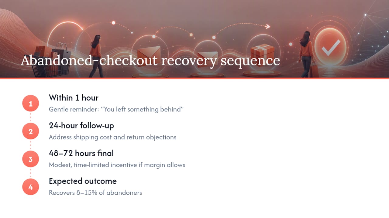
A three-email sequence is the standard structure: a gentle reminder within one hour (“you left something behind”), a second email at 24 hours addressing common objections (shipping cost, return policy), and a final message at 48 to 72 hours with a modest, time-limited incentive if margin allows. Well-executed recovery sequences typically recover between 8% and 15% of abandoners, which on a store losing 70% of checkout starts represents genuine, recoverable revenue rather than a marginal tweak.
Post-purchase, the moment right after payment confirms is prime real estate for a single, relevant upsell offer, since the shopper has already committed and trust is at its peak. Keep it to one offer, closely related to what they just bought, rather than a cluttered cross-sell menu. A tested post-purchase upsell built around one strong SKU consistently outperforms a scattergun approach across several unrelated products, because a single clear offer is easier to say yes to than five competing ones.
Can Shopify Scripts still personalise discounts at checkout?
Shopify Scripts, the older Ruby-based customisation layer for discounts and shipping rules, has been phased out in favour of Shopify Functions on most current plans, but the underlying goal (personalised, rule-based offers at checkout) is more achievable now than it was under Scripts. Functions let you build conditional discount logic that responds to cart contents, customer tags, or order value without touching checkout’s core code.
Practical use cases worth setting up: a automatic percentage discount that triggers once a cart crosses a spend threshold, a free-gift rule tied to a specific product category, or a loyalty-tier discount that only applies to customers tagged as repeat buyers. Each of these runs invisibly in the background and applies at checkout without the shopper needing to enter a code, which removes a small but real piece of friction (hunting for a promo code) that otherwise interrupts an already-decided buyer.
The trap to avoid is over-engineering. A checkout with four or five conditional discount rules running simultaneously becomes hard to debug when something breaks, and harder still to explain to a confused customer who expected a discount that didn’t apply. Keep personalised discount logic to one or two clear rules at a time, document exactly what triggers each one, and test any new rule on a small traffic split before rolling it out to every shopper.
What can Shopify Plus and Shopify Functions add to checkout?
Shopify Plus unlocks a level of checkout customisation that standard plans don’t get, primarily through expanded access to Shopify Functions for validation, discount, and payment customisation logic. This matters most for merchants with complex catalogues, wholesale arrangements, or subscription models where the default checkout rules don’t quite fit.
Concrete examples of what Functions enable on Plus: custom validation that blocks specific payment methods for certain shipping destinations, dynamic discount stacking rules that standard discount codes can’t handle, and payment customisations that hide or reorder methods based on cart contents rather than just customer location. A furniture brand shipping large, freight-only items, for instance, can use a Function to automatically hide express courier options once a cart exceeds a weight threshold, preventing a shopper from selecting a shipping method that was never going to work for their order.
The judgement call is whether your store’s complexity actually justifies Plus-tier customisation. Most stores selling straightforward physical products across a handful of shipping zones get the bulk of available conversion lift from the fundamentals covered earlier: express wallets, clear pricing, fewer fields. Plus-level Functions earn their keep when your business model has genuine edge cases (multi-warehouse fulfilment, B2B pricing tiers, subscription billing) that the standard checkout can’t handle gracefully. Building elaborate custom logic to solve a problem the base checkout already handles is wasted engineering effort.
What analytics tools reveal deep checkout funnel issues?
Shopify’s native Analytics dashboard shows checkout conversion at a summary level, but funnel-specific diagnosis needs a more granular view. Connecting GA4 to your Shopify store via the native integration lets you build a funnel exploration report that shows exact drop-off at each checkout step (information, shipping, payment), broken down by device type and traffic source.
This granularity matters because aggregate checkout conversion can mask a specific problem. A store might show a perfectly reasonable overall completion rate while mobile Safari users are abandoning at three times the rate of desktop Chrome users, a pattern invisible until you segment by device. Given that mobile now accounts for the majority of ecommerce traffic, a device-level blind spot in your analytics can hide your single biggest opportunity.
Session recording tools that integrate with Shopify (watching anonymised recordings of real checkout sessions) add a qualitative layer numbers alone can’t provide. Watching five real shoppers struggle with the same field, hesitate at the same step, or abandon after an error message often reveals the fix faster than a week of dashboard analysis. Pair quantitative funnel data with a handful of session recordings each month, and you’ll usually spot the real issue faster than staring at conversion percentages alone. For a broader look at diagnosing and fixing mobile-specific conversion issues, Moormarketing’s mobile-first CRO breakdown covers the diagnostic process in more depth.
How do you reduce friction for international shoppers with multi-currency?
Shopify Markets lets stores display local currencies automatically based on a shopper’s location, converting prices at checkout without the buyer needing to do mental exchange-rate math. This single change removes a genuine, well-documented source of hesitation. A shopper who sees a price in an unfamiliar currency and has to calculate whether $89 USD is actually a good deal in their own currency is a shopper who is one extra mental step from abandoning.
Beyond currency display, local payment method availability matters just as much. A shopper in a market where a specific digital wallet or bank transfer method dominates will trust a checkout that offers it far more than one forcing an unfamiliar card-only flow. Configure Shopify Markets to show currency and locally relevant payment methods together, rather than treating currency display as the whole solution.
Get the basics wrong and multi-currency backfires. Rounding errors that leave odd-looking prices ($49.97 converting to an ugly $73.42 equivalent), shipping costs still quoted in the store’s base currency, or tax calculations that don’t reflect the destination market’s actual rates all undermine the trust multi-currency is meant to build. Test the full checkout flow in at least two or three of your top international markets before assuming the conversion is working correctly, checking that the final total, not just the product price, displays accurately in local currency throughout.
An editorial take on the 2026 checkout playbook
Most checkout advice still treats the payment step like a design problem, chasing prettier buttons and cleverer layouts. That’s backwards in 2026. Shopify’s one-page redesign already solved the design problem for you. What’s left is a configuration and measurement problem, and it’s less glamorous, which is exactly why so many stores skip it.
The conventional wisdom oversells customisation. Piling Checkout Extensibility features onto an already-solid default checkout, without testing each one, is how stores quietly erode the very conversion rate they’re trying to fix. The bigger opportunity sits in the boring stuff: making sure Shop Pay is actually visible above the fold, making sure your shipping calculation doesn’t lie to shoppers at the last second, making sure your recovery emails actually fire.
If you take one thing from this: prioritise measurement before customisation. A store that religiously tracks completion rate, drop-off, and refund rate, then tests one change at a time, will consistently outperform a store that ships five checkout “improvements” a quarter with no idea which ones actually worked.
— Liza
How Moormarketing can help you fix checkout fast
There’s a real cost to leaving checkout optimisation to guesswork, whether that means an internal team stretched too thin to run proper tests, or months spent tweaking settings without a structured audit behind it. Moormarketing runs checkout work the way it’s described above: audit first, fix the highest-leverage friction fast, validate with testing, then scale what’s proven, handled by senior strategists rather than handed off to a junior account manager.

Engagements typically start with a fixed-scope conversion audit that pinpoints exactly where your checkout is leaking revenue, followed by implementation and ongoing reporting so you can see the lift in hard numbers rather than a vague sense that things feel better. If your store’s checkout hasn’t had a proper review in the last twelve months, or you simply want a second set of eyes before you commit engineering time to Shopify Functions, book a discovery conversation with the team and get a clear read on where your fastest wins actually are.
Sources
For the technical detail behind Checkout Extensibility, Shopify’s own developer documentation on page layouts and rollups is the authoritative reference. The one-page checkout announcement explains the platform defaults referenced throughout this guide, and Shopify’s checkout conversion research covers the Shop Pay data in more depth. For services and case studies, visit Moormarketing’s ecommerce growth guide.
- Shopify dev docs — page layouts and rollups
- Ecommerce visits and orders by device — Statista
- Shopify checkout optimisation guide — Cartylabs