

Product page optimisation is the process of auditing, prioritising and testing the elements on a product page, CTA, imagery, copy, reviews, mobile experience, so more visitors add to cart and check out. It’s not a redesign. It’s a repeatable diagnostic loop.
Do three things before anything else. First, pull your top 10 SKUs by traffic and revenue and audit those pages only, everything else can wait. Second, check whether your add-to-cart button is visible without scrolling on mobile, this single fix moves the needle more than most owners expect. Third, run your highest-traffic page through a speed and mobile usability check, since Baymard’s research identifies unclear product information and mobile friction as leading causes of cart abandonment.
Fixing core product-page UX issues, unclear information, weak imagery, buried CTAs, produces some of the largest conversion gains available to an ecommerce brand, and they rarely require a full redesign.
- Audit your top 10 SKUs by traffic and revenue first, not your whole catalogue.
- Fix CTA visibility and mobile tap targets before touching copy or design.
- Confirm page speed and image compression on your best-performing product page today.
The rest of this playbook, from audit template through to a 60-day implementation sequence, is what Moormarketing runs with clients who want structured, sequential improvement rather than a one-off facelift.
Key Takeaways
Product page optimisation works because it replaces guesswork with a sequenced, measured testing cycle, prioritising the highest-traffic pages and the lowest-effort, highest-impact fixes first.
| Point | Details |
|---|---|
| Audit top SKUs first | Score your highest-traffic, highest-revenue pages before touching anything else. |
| Fix mobile and CTA visibility | Sticky mobile add-to-cart and high-contrast CTAs are near-zero-risk quick wins. |
| One KPI, one or two guardrails | Every test needs a single primary metric plus AOV or return-rate protection. |
| Layer social proof across the page | Aggregate rating in the hero, quotes mid-page, photo reviews near the CTA. |
| Review cadence every 30 to 60 days | Reassess audit scores and test queue on a fixed schedule rather than ad hoc. |
| Consider Moormarketing for structured programs | Moormarketing offers audits, 12-week sprints and ongoing retainers built on sequential testing. |
Table of Contents
- What does a product page optimisation audit actually check?
- How do you decide which pages to fix first?
- What are the essential product-page elements to optimise?
- What’s the right way to test and measure product page changes?
- What quick wins improve product pages without a redesign?
- Why do mobile UX and page speed matter this much?
- What mistakes quietly hurt product page conversions?
- When should you bring in an agency for product page optimisation?
- How does Moormarketing structure a product page optimisation project?
- What does a 30 to 60 day implementation schedule look like?
- How can personalisation improve product pages?
- Why continuous testing beats a one-off redesign
- How Moormarketing helps you fix and grow product page performance
- Sources
What does a product page optimisation audit actually check?
A proper audit takes 30 to 90 minutes per page if you use a template instead of eyeballing it. You’re scoring ten categories, not writing an essay.
Work through the hero conviction stack first (the promise, the price, the primary CTA, and the first objection killer, all visible without scrolling), then move to imagery, variant selection, product copy, reviews, an FAQ block, shipping and returns information, page speed, and mobile tap-target sizing. Shopify’s optimisation guide treats these as the standard set worth checking on every high-traffic page.
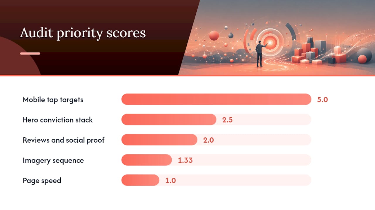
Score each category on two axes: impact (1 to 5, how much revenue is likely riding on it) and effort (1 to 5, how hard it is to fix). Divide impact by effort and you get a rough priority number, anything above 2.0 goes to the top of your list.
| Audit category | What “good” looks like | Impact (1-5) | Effort (1-5) |
|---|---|---|---|
| Hero conviction stack | Promise, price and CTA visible with zero scroll | 5 | 2 |
| Imagery sequence | Lifestyle hero, detail angles, scale reference, UGC | 4 | 3 |
| Reviews and social proof | Rating in hero, quotes mid-page, photos near CTA | 4 | 2 |
| Mobile tap targets | CTA and variant selectors sized for thumbs | 5 | 1 |
| Page speed | Loads quickly on 4G | 4 | 4 |
Pro Tip: Before you touch a single element, watch five session recordings on your top SKU using a tool like Hotjar or Microsoft Clarity. Ten minutes of watching real shoppers hesitate at your size chart tells you more than a week of guessing.
How do you decide which pages to fix first?
Multiply three numbers: traffic exposure, revenue per SKU, and how leaky the page is, based on your audit score from above. A page with modest traffic but a shocking mobile bounce rate can outrank a high-traffic page that’s already performing reasonably well.
Sequence your tests in this order, because each stage builds on the credibility the last one established:
- Fix the conviction stack first (hero promise, CTA placement, primary objection handling).
- Layer in the social proof cascade second (aggregate rating up top, curated quotes mid-page, photo reviews near the add-to-cart button).
- Add micro-commitments last (size guides, quantity nudges, delivery estimates right before the button).
A few concrete test ideas worth running in that order:
- Test the hero CTA colour and copy against your current control. Primary KPI: add-to-cart rate. Guardrail: average order value shouldn’t drop.
- Test moving photo reviews above the fold on mobile. Primary KPI: cart-to-purchase rate. Guardrail: return rate stays flat.
- Test adding a scale-reference image to your top three SKUs. Primary KPI: add-to-cart rate. Guardrail: monitor return rate for sizing-related returns.
What are the essential product-page elements to optimise?
Group your work into three zones: what shoppers see without scrolling, what convinces them mid-page, and what pushes them to actually click buy. Trying to fix all eleven elements at once is how projects stall, work zone by zone instead.
Above the fold, your CTA needs high contrast against the background and should restate the core promise, not just say “Add to Cart” in isolation. D2C Times calls this the conviction stack, and it argues the first viewport should state the promise, kill the biggest objection, and create forward momentum, all before a shopper scrolls once. Your hero image should be a lifestyle shot, not a plain product-on-white image, since that’s what earns attention first.
Mid-page, your imagery needs a deliberate sequence. VWO recommends leading with the lifestyle hero, following with detail angles, adding a scale reference (a hand, a ruler, a comparison object), then finishing with user-generated photos. Variant selectors need to update the hero image the instant a shopper picks a colour, nothing kills trust faster than clicking “Navy” and seeing a beige product stay on screen. Your product description should lead with the benefit, not the material spec, save the technical details for a collapsible section further down. Reviews belong in three places, not one: aggregate rating near the price, a couple of detailed quotes mid-page, and photo reviews right before the CTA, a layered approach that addresses different stages of buyer hesitation.

Near the add-to-cart button, this is where FAQs, cross-sell modules and checkout reassurance live. A scrollable FAQ block answering shipping timeframes, sizing and returns removes the need for a shopper to open a live chat. Cross-sell suggestions here (bundle discounts, “frequently bought with”) lift average order value without distracting from the primary purchase, and tactics like QR-driven bundle prompts are worth testing for average order value gains if you sell in physical retail alongside online.
Pro Tip: Check your image-to-variant linking manually, on mobile, at least once a quarter. It’s the single most common bug that quietly tanks conversion on colour-variant products, and analytics rarely flag it directly.
- CTA: high contrast, benefit-led copy, visible without scroll.
- Imagery: lifestyle hero first, then detail, scale reference, UGC.
- Variants: image swaps instantly on selection, no lag.
- Descriptions: benefit-first, written for scanning, not reading.
- Reviews: layered across hero, mid-page and near-CTA.
- Trust signals: security badges, guarantee copy, near the button.
- Video: short, autoplay-muted, showing the product in use.
- Cross-sell: bundle or “frequently bought with” module.
- Checkout options: guest checkout visible, multiple payment methods shown.
- Mobile: sticky ATC bar, thumb-sized tap targets.
- FAQ: scrollable block covering shipping, sizing, returns.
What’s the right way to test and measure product page changes?
Run one primary KPI per test, always. Pick add-to-cart rate, cart-to-purchase rate, or revenue per visitor, then set one or two guardrails, typically average order value and return rate, so you’re not celebrating a win that quietly increases refunds. Shopify’s guidance treats this single-KPI-plus-guardrail structure as the baseline for any credible test.
For most growth-stage brands, that means running one major test per month rather than five simultaneous tweaks. Smaller stores with lower traffic need longer test windows to reach statistical confidence, sometimes four to six weeks per test, while higher-traffic brands can turn results around in one to two weeks.
Track diagnostic metrics alongside your primary KPI: add-to-cart rate tells you if the hero and imagery are working, cart-to-purchase rate tells you if checkout friction or shipping surprises are costing you, and review engagement rate (clicks on the reviews tab, time spent scrolling reviews) tells you whether your social proof is actually being read.
Shopify’s benchmark data referenced by D2C Times puts the median product detail page conversion rate around 3.1%, with top-decile brands reaching close to 7.9%. That gap is almost entirely explained by the on-page fundamentals covered above, not by traffic quality or pricing.
- Choose one KPI per test: add-to-cart rate, cart-to-purchase rate, or revenue per visitor.
- Set guardrails on AOV and return rate before you launch.
- Run tests for a minimum of one full sales cycle before calling a winner.
What quick wins improve product pages without a redesign?
You can ship most of these directly, no test required, because the downside risk is close to zero and the upside is well established.
- Increase CTA contrast against the page background. Half a day. Ship directly, high confidence.
- Add a sticky mobile add-to-cart bar. One to two days of developer time. Ship directly, this consistently reduces mobile drop-off.
- Fix image-to-variant linking bugs. One day of QA plus dev time. Ship directly, it’s a bug fix, not a design choice.
- Add real inventory counts or urgency indicators (“Only 4 left”). Half a day if your stock data is already synced. A/B test this one, urgency messaging can backfire if it feels manufactured.
- Move photo reviews above the fold on mobile. One day. A/B test, since placement effects vary by category.
- Compress hero and gallery images. One day. Ship directly, speed gains rarely hurt and often help.
- Add a scale-reference image to your top SKUs. Two to three days for photography. Ship directly once shot, this addresses a common sizing objection.
Why do mobile UX and page speed matter this much?
Because most of your traffic is mobile, and mobile-specific friction is invisible on desktop. A page that converts fine on a laptop can be losing a third of its mobile visitors to a CTA buried below three scrolls of specifications, or a hero image that takes four seconds to render on a train commute.

Baymard’s aggregated case-study data points to mobile UX problems, small tap targets, unclear sizing guidance, slow image loading, as one of the biggest sources of quiet conversion leakage. Fixing them doesn’t require a redesign, it requires a checklist.
Watch both lab metrics (Lighthouse scores, simulated load times) and field metrics (real user Core Web Vitals from Google Search Console) rather than relying on either alone. Lab metrics tell you what’s technically possible, field metrics tell you what actual shoppers on actual devices are experiencing.
| Mobile check | Target | Common tool |
|---|---|---|
| CTA tap target size | Minimum thumb-sized tap targets | Lighthouse audit |
| Page load (4G) | Quick load times | Google PageSpeed Insights |
| Image file size | Compressed, next-gen format (WebP) | Squoosh or built-in Shopify compression |
| Third-party scripts | Audited quarterly for bloat | GTmetrix waterfall view |
- Persistent add-to-cart bar that follows the scroll on mobile.
- Compressed images served in modern formats, not raw uploads.
- Quarterly audit of third-party scripts (chat widgets, pixels, review plugins) that silently add load time.
What mistakes quietly hurt product page conversions?
The most common failure is cosmetic-only testing, changing a button colour and calling it optimisation while the actual objection (unclear sizing, no return policy visible, slow load) goes untouched. You’ll see this in analytics as flat cart-to-purchase rates even after a “successful” CTA test.
Running simultaneous multivariate tests on the same page is another trap, especially for lower-traffic stores that don’t have the volume to reach significance on multiple variables at once. You end up with a result you can’t actually attribute to anything.
Overloading the hero with distractions, pop-ups, chat prompts, countdown timers, and unrelated promotions all fighting for attention in the first viewport, dilutes the conviction stack instead of strengthening it. A single review widget crammed at the bottom of the page, instead of the layered cascade described earlier, also underperforms because it only reaches shoppers who scroll that far.
Shipping surprises hidden until checkout are a silent killer. If your return rate is climbing while your add-to-cart rate looks healthy, check whether shipping costs or delivery windows are only revealed at the final step, that gap between add-to-cart and purchase is where undisclosed costs do their damage.
When should you bring in an agency for product page optimisation?
Bring in an agency when you don’t have the internal bandwidth to run sequential tests properly, when you need someone senior enough to interpret ambiguous results without guessing, or when your last three “optimisation” attempts were really just redesigns with no measurement plan behind them.
A competent agency engagement should deliver an initial audit with prioritised scoring (similar to the framework above), a sequenced testing roadmap, hands-on implementation support, and a monthly test cadence that compounds rather than resets each time. Expect the first audit and roadmap within two to three weeks, with the first test live inside four to six weeks of kickoff.
Ask prospective agencies these questions during procurement:
- What’s your primary KPI and guardrail methodology for a typical test?
- Can you show a before-and-after audit example from a past client?
- How many tests do you run concurrently on one page, and why?
- What’s your typical timeline from audit to first live test?
- Who on your team actually implements changes, senior strategists or outsourced developers?
- How do you handle a test that shows no significant result?
- What reporting do we see, and how often?
- Do you work across Shopify and WordPress, or just one platform?
A “good” answer sounds specific: named metrics, a real cadence, an honest account of a test that failed. A vague answer talks about “boosting engagement” without ever naming a KPI, that’s a red flag worth walking away from.
Product page optimisation FAQ
How long does a product page optimisation project take to show results? Most sequential programs show measurable movement on the first test within four to six weeks, with compounding gains building over a 90 to 180 day cycle.
Do I need a full redesign to improve conversions? Rarely. Most of the highest-impact fixes, CTA contrast, image sequencing, mobile tap targets, sit on top of an existing design.
What’s a realistic conversion rate to aim for? Shopify benchmark data cited by D2C Times puts median PDP conversion around 3.1%, with top performers near 7.9%, a useful target range rather than a guarantee.
How does Moormarketing structure a product page optimisation project?
Every engagement runs through the same five stages, in the same order, because skipping steps is how clients end up with a pile of untested changes and no idea which one actually worked.
- Discovery. Audit the highest-traffic, highest-revenue SKUs using the scoring framework above, plus a review of session recordings and existing analytics.
- Hypothesis design. Turn audit findings into a ranked list of testable hypotheses, each with a named primary KPI and guardrail.
- Sequential testing. Run one test at a time, in priority order, giving each enough time to reach a real result before moving to the next.
- Infrastructure rollout. Once a test wins, implement it properly across the catalogue, not just the one SKU it was tested on.
- Compounding program. Repeat the cycle monthly, layering new hypotheses on top of what’s already been proven.
| Client type | Before | After |
|---|---|---|
| New toy retailer | Pre-launch, no PDP traffic history | Scaled to $2 million in monthly sales conversion |
| Global furniture brand | Underperforming PDP conversion | Reached $3 million a month in tracked sales |
Clients get a shared dashboard and a monthly review call, senior strategists handle implementation directly rather than handing it to outsourced contractors, which is part of why the testing cadence stays consistent month over month instead of stalling after the first round.
What does a 30 to 60 day implementation schedule look like?
Assign clear ownership week by week so nothing sits in limbo waiting for “someone” to pick it up.
- Week 1 to 2: Discovery and audit. Owner: whoever runs analytics access, agency or in-house lead. Deliverable: scored audit across top 10 SKUs.
- Week 3 to 4: Conviction-stack test goes live. Owner: developer plus strategist. Deliverable: first test results against primary KPI.
- Week 5 to 6: Social proof cascade implementation (layered reviews). Owner: content and dev team. Deliverable: reviews restructured across hero, mid-page, near-CTA.
- Week 7 to 8: Pre-cart modules (FAQ, cross-sell, micro-commitments). Owner: content lead. Deliverable: live FAQ block and cross-sell module.
- Week 8+: Infrastructure rollout across the wider catalogue. Owner: dev team. Deliverable: winning changes applied beyond the original test SKUs.
A simple test brief template covers four things: the hypothesis, the primary KPI, the guardrail metric, and the minimum test duration. Keep it to one page, longer briefs slow teams down without adding clarity.
- At the 30-day mark, present the audit, the first test result, and a revised priority list.
- At the 60-day mark, present cumulative KPI movement, guardrail status, and the next quarter’s test queue.
How can personalisation improve product pages?
Static product pages show the same content to every visitor, which leaves revenue on the table for anyone who’s already shown intent. Dynamic content based on browsing behaviour, past purchases, or referral source closes that gap without requiring a different page for every segment.
A returning visitor who’s viewed a product three times without buying might see a different micro-commitment, a size guide, a delivery estimate, than someone landing on the page for the first time from a social ad. Shoppers arriving from a specific campaign can see hero copy that echoes the ad they clicked, which keeps the promise consistent from click to page load. Even something as simple as showing “recently viewed” or “customers also bought” modules based on actual browsing history outperforms generic bestseller lists, because it reflects what that individual shopper has actually shown interest in.
The practical starting point isn’t a complex personalisation engine, it’s segmenting your existing traffic (new versus returning, paid versus organic) and testing one variable at a time within each segment, using the same single-KPI, guardrail-based testing rules covered earlier.
Why continuous testing beats a one-off redesign
Continuous product page optimisation compounds revenue faster than a single redesign ever will, and the reason is almost mechanical: a redesign gives you one data point, while a testing cycle gives you ten.
Most owners treat CRO as a project with an end date, hire someone, ship a new page, move on. That’s the instinct I’d push back on hardest. A redesign bakes in whatever assumptions your designer had that month, tested or not, and once it’s live, there’s rarely a plan to revisit it until the next redesign, often a year or more later. Meanwhile a page running through monthly sequential tests is accumulating evidence the whole time, each win becomes the new baseline for the next hypothesis, and the gains stack instead of resetting.
Pro Tip: Keep your testing cadence boring and predictable, one test per month, same reporting format, same KPI discipline. The teams that get the best compounding results aren’t the ones running the cleverest tests, they’re the ones who never skip a cycle.
This is also the practical case for hiring rather than Dying it long-term. A one-off engagement can fix your worst page. An ongoing cadence, with someone senior enough to read ambiguous results correctly, is what turns one good test into twelve good tests a year.
*— Liza
How Moormarketing helps you fix and grow product page performance
Moormarketing runs product page optimisation as a structured, senior-led program, not a checklist handed to a junior contractor. You get audit, sequential testing, hands-on implementation and ongoing mentoring from the same strategists throughout, which is what keeps a testing cadence from quietly falling apart after month two.
There are a few ways to work together depending on where you’re at. A one-off audit gives you the scored diagnostic and prioritised roadmap covered earlier, useful if you want a clear starting point before committing further. A 12-week optimisation sprint, similar to the structure in the 12 Week Double Your Revenue Challenge, runs three to four sequential tests with full implementation support. An ongoing retainer keeps the monthly cadence running indefinitely, layering new hypotheses on proven wins. And a workshop format, through the eCommerce Marketing Workshops, suits owners who want their internal team trained on the framework directly.
If your product pages are converting below the benchmarks covered above, start with a conversation. Book a discovery call with Moormarketing and bring your top 10 SKUs by traffic, we’ll tell you honestly where the leaks are.
Sources
The benchmark figures and testing framework in this piece draw on Shopify’s product page optimisation guide for KPI and guardrail methodology, Baymard’s ecommerce CRO research for the UX and mobile friction data, ConversionStudio’s benchmark summaries for expected lift ranges on common fixes, VWO’s product page checklist for imagery sequencing, and D2C Times’ PDP rebuild framework for the conviction-stack architecture and conversion benchmarks.
If you’re evaluating agencies, ask for a sample audit before signing anything, a credible partner will happily show you how they score and prioritise pages. For a broader view of how product-page work fits into overall ecommerce growth planning, the Moormarketing homepage outlines the full range of services available alongside PPO.
- Improve conversions with product page optimization (Shopify)
- Ecommerce conversion rate optimisation (Baymard)
- eCommerce product page best practices in 2026 Examples (VWO)
- How to rebuild your product detail page for 8%+ conversion in 2026 (D2C Times)