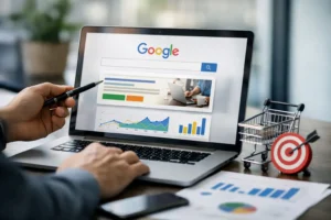
If your Google Ads are pulling solid clicks but sales still look flat, the problem usually is not the ad account. It is the page after the click. The best google ads landing pages do one job exceptionally well – they carry buying intent forward without friction, confusion or wasted motion.
That sounds obvious, yet most brands still send paid traffic to pages built for browsing, not conversion. A home page asks people to explore. A category page asks them to compare. A strong landing page asks for one clear next step and makes that step feel easy, credible and worth it.
What the best Google Ads landing pages get right
The highest-performing landing pages are not necessarily the prettiest pages on the site. They are the most aligned. The keyword, the ad copy and the page all need to feel like part of the same conversation. When someone searches with intent, clicks an ad that makes a promise, and lands on a page that confirms that promise immediately, conversion rates rise fast.
That first screen matters more than most brands want to admit. If the headline is vague, the offer is buried, or the design looks like it belongs to a different campaign, the click starts leaking value straight away. You paid for intent. Do not force people to hunt for relevance.
Message match is the foundation. If your ad promotes same-day quotes, the page should lead with same-day quotes. If your ad speaks to wholesale pricing, the page should not open with a generic brand statement. Great landing pages reduce cognitive load because they feel expected. Familiarity wins.
The anatomy of a page that converts paid traffic
A strong headline is not copywriting theatre. It is confirmation. It tells the visitor they are in the right place and gives them a reason to stay. Most brands overcomplicate this by chasing cleverness. Clear beats clever nearly every time in paid traffic.
Below that, the page needs a tight value proposition. Why this offer, why now, and why should someone trust you? For eCommerce, that might mean spotlighting product benefits, shipping thresholds, returns policy and customer proof. For lead generation, it often means outcome, timeframe and a low-friction way to enquire.
The call to action should be obvious and repeated without being obnoxious. If the page asks for a purchase, keep the path to purchase short. If it asks for a lead, trim the form fields to what sales actually needs. Every extra field is a tax on conversion. Sometimes it is justified. Often it is just habit.
Trust markers do heavy lifting here as well. Reviews, client logos, media mentions, guarantees, certifications and before-and-after proof all help, but only when they are close to the decision point. A testimonial buried near the footer does less than one placed next to the form or add-to-cart area.
Why intent matters more than design trends
A lot of underperforming pages are built around what the brand wants to say rather than what the searcher wants solved. That is where campaigns lose efficiency. Someone searching a high-intent term is not looking for a brand story first. They want evidence that you solve their problem better, faster or more profitably than the alternatives.
This is why the best google ads landing pages are built by traffic temperature and keyword intent, not by internal politics. Cold non-brand traffic usually needs more proof, more clarity and fewer assumptions. Branded search can convert on leaner pages because trust is already partially established. Comparison keywords may need stronger differentiation. Local service terms may need location proof and immediate contact pathways.
There is no universal best layout. It depends on the query, the offer, the average order value and how much trust someone needs before acting. A $49 impulse product and a $15,000 service quote should not land on the same page structure.
Common mistakes that kill conversion rate
The biggest mistake is sending all traffic to one generic page. Paid traffic is expensive. Generic pages create generic results. If you are bidding on different themes, services or products, you need landing experiences that reflect those differences.
The next problem is clutter. Too many navigation options, too much text before the offer, too many competing CTAs. A landing page is not a website tour. Every extra exit point reduces focus. In some cases, keeping top navigation minimal or removing it altogether improves performance. In others, especially for higher-consideration offers, some navigation helps legitimacy. Again, it depends.
Speed also gets underestimated. Slow pages do not just annoy users – they waste ad spend. Mobile users are even less forgiving, and for many accounts they make up the majority of clicks. Heavy images, bloated scripts and messy page builders quietly kill ROAS.
Then there is weak proof. Founders often know their offer is good and assume the page communicates that automatically. It does not. Claims need support. Show results. Show customer outcomes. Show specifics. Vague statements like quality service or premium products do not move serious buyers.
Best Google Ads landing pages for eCommerce brands
For eCommerce, the winning pages usually sit somewhere between a product page and a campaign page. They stay focused on one collection, one hero product or one buying problem. Instead of dumping users into a broad catalogue, they narrow the path and increase buying confidence.
A good eCommerce landing page leads with the product-market fit angle. It tells the shopper who the product is for, what problem it solves and why it is a better buy than the alternatives. Then it removes friction with social proof, delivery details, FAQs, guarantee language and strong imagery that answers real buying questions.
Bundles, best-seller edits and gift-focused pages often work well for paid traffic because they reduce choice paralysis. Too much choice is not a growth strategy. It is a conversion leak. Curated offers tend to outperform sprawling product grids when traffic is coming from a clear ad promise.
For subscription brands, retention signals matter upfront. If the customer is likely to ask about skip options, cancellation terms or delivery frequency, answer those objections before they become reasons to bounce.
Best Google Ads landing pages for lead generation
Lead generation pages win when they make the next step feel commercially sensible. That means the offer must be strong enough to justify the enquiry. Free quote, free strategy session and book a call are not inherently compelling. They need context. What happens next? How quickly? What sort of outcome should the prospect expect?
The form should match the intent level. If someone is searching for a high-urgency service, a short form and phone-first design can work brilliantly. If the service is more complex or sales qualification matters, a slightly longer form may improve lead quality. Lower conversion volume is acceptable if revenue per lead improves. The right metric is not form fills. It is profitable customer acquisition.
Pages for trade, real estate, professional services and higher-ticket consulting usually benefit from strong local proof, direct language and a visible human element. People want to know who they are dealing with. A polished design helps, but credibility closes the gap.
How to improve your landing pages without rebuilding everything
You do not need a complete redesign to get a lift. Start with the opening screen. Tighten the headline so it mirrors the ad. Bring the CTA higher. Add a proof element near the form or purchase area. Strip out anything that distracts from the primary action.
Then look at behavioural data. Where are users dropping off? Are they not scrolling, or are they scrolling and hesitating? That distinction matters. If they are not scrolling, your opening screen is weak. If they are reaching the offer and failing to convert, the issue is usually trust, clarity or friction.
Test one meaningful variable at a time. Offers, headlines, CTA wording, form length, pricing presentation and proof placement can all move performance. Button colour rarely changes the game on its own. Foundational CRO beats cosmetic tweaks.
If your campaigns span multiple audiences, build dedicated variants. Founders chasing scale often resist this because it feels like more work. It is more work. It also tends to produce better economics. More relevance usually means stronger conversion rates, lower acquisition costs and more room to scale.
Teams that treat landing pages as revenue assets, not design projects, usually pull ahead. That is the difference between running ads and building a system that compounds.
The best landing pages are not the ones that win design awards. They are the ones that turn expensive clicks into profitable action, consistently, at scale. If your ads are doing their job, your page needs to meet them at the same standard.